#and little websites to see if they were compatible
Explore tagged Tumblr posts
Text
july 1 - astrology - @jegulus-microfic - word count: 319
Regulus never believed in astrology and star signs, for it made him remember something about his family and his past. He didn’t care about what his sign was or what future he had from the way the sky was during his birth. In fact, he’d rather not get any hopes up (or have them die) with those stupid “superstitions.”
So when Pandora and her new acquaintance, Sybil Trelawney, offered to share how compatible James and he was, his initial reaction was to refuse. But James wanted to know and so happened to be there at the time, so how could Regulus deny this golden boy?
“I already know everything for Reggie, it’s you that I’m going to need to interrogate,” Pandora explained, having Sybil flip through pages in one of her books.
James began to talk nonstop about what happened on his birth, the exact time and date, and what year it was. He was a rather curious child, so asking for little bits of information from his parents as a way of getting attention was a habit of his.
After about an hour of getting James’s information, they finally found a certain page that matched the two together.
Pandora eagerly read from Sybil’s shoulders, keeping an upbeat look in her eyes. She glanced from the page to them, then looking at the girl who still read the pages in her head. “You guys are compatible!” she yelled with a smile, slamming the book before Sybil could finish.
She excitedly held the two’s hands in hers, smiling happily. Her Reggie really did find someone good. Although the future Sybil had seen..
“I knew it from the start. Cancer and Aries? I knew that was a good match.”
James and Regulus glanced at each other, both giving a stare with a little longing in it.
“It also mentions being compatible sexually so..”
And the two were off quicker than ever.
#tried to use canon birthdays#and little websites to see if they were compatible#sorry if it’s wrong#jegulus#harry potter fandom#jegulus microfic#jegulus fanfiction#regulus arcturus black#james fleamont potter#james loves regulus#james potter x regulus black#james x regulus#james potter#regulus x james#regulus black#pandora lovegood#pandora rosier#pandora#sybil trewlaney#sybill trelawney#astrology#cancer sign#aries sign
59 notes
·
View notes
Text

Omega retreat : Chapter 2
Pairing: Alpha Bucky × Omega Reader
Warnings: R18, Eventual Smut, Not what it seems, talk of medical issues/illness, dating site, ABO dynamics
Word count: 2477
Chapter 1
Bucky masterlist
Summary: As an unmarked and lonely omega you find a flyer for a service called The Omega Retreat.
You are paired with a compatible alpha to spend your heat or just a week at a luxurious cabin at a forest resort. Amenities and Utilities included. Enjoy the beautiful scenery, fresh air, as well as the company of an alpha of your choosing. What could possibly go wrong?

The blue screen of your laptop lit up the dark and gloomy room as you booted it up and set your sights on the internet explorer icon.
Your eyes shift back and forth from the slightly crunched flier to the keyboard as you type up the website in the search bar.
Upon clicking enter, there is a cascade of red and pink hearts across the screen before the main page comes into view.
From the photos, it seems kind of like a glamping thing, with each couple or pairing having their own semi-remote cabin.
Singles retreats weren’t a new concept—not that you’ve ever been to one, but this would be a whole week alone with a stranger, a man, an alpha.
That familiar twang of anxiety twisted in your chest at the thought, only for it to be snuffed out by another.
‘We all have to grow up at some point’.
You eyed the two packages listed on the screen, one labeled as Silver and the other Gold. The silver package went by, Forget me knot.” and you felt yourself chuckle a little at how cheesy it sounded. It was a 4-day stay at one of the cabins with an alpha provided by the website's dating algorithm.
The Gold package had another cheesy line listed as “Heat of the Night." It listed a full-week stay for the duration of the omega’s heat with your new Alpha.
The prospect was, of course, very tantalizing, but it still didn’t fail to make you nervous. You had never spent a heat with someone before, and it seemed a little scary. Was a week with a stranger worth seeing what you were missing out on?
You clicked the icon for the Gold package without thinking further, blinking at the screen as it shifted to the sign-up page. You’d only wanted further info but it looked like only members could access it. It was, however, free to sign up, a claim made by many websites and apps before it. Yet, even at the free level, it seemed you could at least get to look at the Alpha bachelors they had in their database. Just another step to pull you in closer to spending the big bucks.
It asked for a photo at first, making you hesitate before finally deciding on one simple photo of yourself. It had been your birthday, and your mother was by your side, hugging your shoulder. You had to crop out most of your mom, but your big smile still beamed just as brightly across the screen. You typed in a shortened version of your name for your little profile, along with your age, before clicking the next button.
The page flipped to a quick questionnaire, asking about your likes and dislikes—everything from your bedtime routine to your bedroom habits. It barely toed the line of TMI, but you supposed it had to be thorough to find you a match. You clicked through each question, making sure every answer felt right. Before you could tell, it had been half an hour and you were only almost finished. You snuggled yourself into your plush couch as you finally clicked the submit button.
A little spinning heart pops up on the scream alongside ‘finding your perfect match’ underneath it. The heart spun around on the screen until the loading bar hit 100 and the page shifted over to show your results.
Your eyes widen at the selection of handsome men flooding the screen. There are more Alphas flashing over your computer than you’ve ever seen in one small space, and already there are too many to choose from.
Part of you figured that to a seasoned romantic, it would seem like small potatoes, but to you, it was more men than you knew what to do with. The only distraction that could tear your eyes away was a heart-shaped character at the corner of the screen babbling away in a little text box. His happy little demeanor reminds you of a certain talking paperclip from old office software. Only you found this little guy less irritating.
‘We have selected 20 of your most suitable partners. Please choose from the profiles below to chat and find your match.’
You clicked the speech bubble away, only for another to pop up.
‘Don’t forget to check out our selection of getaways for your official meetup’ popped up across the page.
You clicked again, and another bubble came after.
‘If for any reason you are unsatisfied with your matches, please take the quiz again.’
You take the little heart man’s words into consideration before clicking back towards the alpha profiles.
The first was a rough-looking man named Brock. Too macho for your type, and you shied away from his profile immediately.
The next one was a sweet, gentle-looking man named Steve. He seemed really interested in a lifetime mate, but as romantic as it seemed, you just weren’t too sure that was what you wanted just yet.
It was a little overwhelming. All these men were stunning, and yet the scared little omega inside of you kept turning tail at the gleam of each of their smiles, leading you to click at the next button again and again.
You’d gone through 12 profiles until you stopped on his picture. His brown hair sat at the base of his neck, looking soft and supple enough to tangle your fingers through, and his smile was immediately infectious.
The name James ‘Bucky’ Barnes sat below the photo in bold, but you barely noticed as your gaze locked on his light, smiling blue eyes.
You feel both your heart and your core flutter, leading to a wave of warmth and a bit of unearned embarrassment. You didn’t think any further before clicking his profile, showing you more about this ‘Bucky’.
It gave a broad list of hobbies, his likes and dislikes, as well as so many more dreamy photos.
His profiles stated he was interested in a mate but “wanted to test the waters first." Not interested in being too serious, but not scared of a commitment.
Even though this man seemed like an absolute dream, you couldn’t help but second-guess yourself. Yet, the butterflies in your stomach overpowered the worries in the back of your mind. You let your cursor hover over the match button on his profile before slowly clicking down on the mouse and watching with bated breath as the screen changed again.
That little heart man, now less animated, was the last sight you saw after you clicked. He was accompanied by a few speech bubbles saying, “The alpha you have chosen will be notified; please feel free to browse our events as you wait.”
The word ‘events’ was lit up in another color separate from the text and clearly a link to the rest of the website. At the end of the day, they WERE trying to sell you something, but curiosity got the better of you, and you clicked the link without another thought.
You looked over the two packages they offered and let your cursor hover over the gold package. You stared at its short description, comparing it with the smaller vacation bundle that sat beside it on the screen. You think it over and cautiously click on the icon.
The prices were the first thing that struck you, as none of them were very expensive for what they were advertising. Saving a few bucks always seemed to sweeten the deal, but it really made it all seem too good to be true.
The resort has a full staff available in case of an emergency and are simply a call away. All meals would come in the form of meal kits or ready-made gourmet dinners, as well as a selection of wine and spirits for those 21 and over.
There was a little policy note at the bottom, in smaller letters.
“All reservations are refundable upon cancellation 7 days before the date of the reservation. If you cancel your stay after 7 days, you will be charged a cancellation fee. In the event that your desired partner declines your match, you will be prompted to choose another alpha from the list given to you.”
The idea of being rejected by a stranger online made some of the appeal wear thin. You x-ed out of the pop-up, only to notice a notification lighting up your screen.
He had matched with you immediately, causing another flutter of hearts to pulse over the computer for one moment. On the little message icon sat the number one to indicate somebody had reached out to you, and you clicked on it right away.
The chat room opens up on your screen to show a little chat box bubble saying, “Hi beautiful ;)". The old-style winky face gave his age away and made some of the insecurities in your belly melt.
This 'James' had matched you so soon, and to have him reach out to you on your screen still made you nervous.
The bouncing dots popped up below the first message to indicate he was still typing. You're frozen on the spot as the messages just keep popping up.
“Hello?”
It seemed a bit impatient, but you didn’t think to care; you were too thrilled by this new encounter.
“Hi, sorry, I was..” Oh god, what could you say? “…away from the phone.” Not true, but telling your possible new beau that you were frozen with fear upon seeing his message seemed, well, lame.
“That’s ok.”
“You new here? I haven’t seen your profile before.”
“Yeah. I just signed up.”
“Does that mean I was your first choice? ;)”
You felt you should be honest after your previous fib, and answered immediately.
“ I just saw your profile and clicked it right away. I didn’t expect you to get back to me so soon.”
“Leave a beautiful Omega like you waiting? Not a chance, doll.”
Every word made the air grow thinner, making your head just swim in the rising heat that started to subtly overtake your body. It was such a new feeling to have warmth in your body feel so good.
Those three dots danced across his next speech bubble, and you waited every second for his next word.
“Have you ever been with an alpha before? I’d hate to come on too strong and scare you away.”
Your breath felt shallow before you answered truthfully. “No, I haven’t.”
There have only ever been two people you’ve given yourself to like that. Two particularly nice betas who just couldn’t help you as you needed, but tried anyway. Being with an Alpha seemed like so much more of a big deal, but the idea of a big, horny monster sinking their teeth into your flesh makes you start to hyperventilate. It was permanent, and you didn’t want to just throw away your forever to someone who could be cruel to you.
But something about this felt different. He looked so soft and kind, you could nearly feel his finger gently caressing your cheek as each word popped up on your screen. Something about this encounter felt safe.
You typed without thinking, letting the question fill the screen as anxiety ate away at the warmth that once sat in your belly. “Does that bother you?”
You waited for a response, watching those little dots until they disappeared without a new message. A solid minute felt like an eternity, and your heart sank further as each one ticked by.
You typed out a quick “I’m sorry," hoping you weren’t the one scaring him off instead with your lack of experience.
You breathed a sigh of relief as his response popped up. “Do not be sorry. There is no problem with wanting to wait.” Followed by another “I feel like a lucky guy.”
“I guess I’m just a little embarrassed; I’m glad it doesn’t bother you.” You typed away, fully engrossed in his attention.
“Don’t be; that kind of thing means more than you’d think in this day in age.”
It popped across your screen, giving you much-needed relief, only for the next message to set your nerves ablaze all over again.
“What made you decide to join the site?”
It popped over your screen faster than you could shoo it away. The reason for you was obvious after dragging yourself through that doctor's office. You needed help, and somehow that simple red flier had shown out to you like a beacon on a stormy shore.
You wanted to be honest, but some things felt better kept close to yourself than within the reach of others. You answered with the shallow truth.
“Dating can be difficult. I found the advertisement today and decided to check things out.” You tapped the enter button and sent the message, but your fingers continued to type. Maybe it was an attempt to keep his questions from probing into your answer even further, as you sent him an inquiry of your own.
“What about you? What made you decide to join the website?”
The laptop sat silently, aside from the whirring of its little fan. No bouncing dots, no indication of his response. Maybe his reasons were somehow more personal than your own.
You began to lose a little faith as the chat room continued to sit empty until his chat bubble finally popped up. Each second it took for the words to show was a second too long.
“I’d say it’s about the same. I guess I just wanted to try something different.”
“And how’s it working out so far?”
“I’d say, far better since you popped up.”
It was such a cliche line, but you loved it. You even laughed a little as you typed back.
“That fast, huh? It’s been less than a day "
“But you’ve already made my whole week.”
It brought an immediate smile to your rosy face. It was so fun—almost a fantasy. No danger, no recourse, no fear. You looked back at his little picture on the screen, his smiling face; it was a far cry from any other alpha already, and you hadn’t even seen him in the very flesh.
But it had been less than a day, and it was an obvious blow to this little oasis that had built around you in the matter of minutes. You didn’t want this moment to end, not when reality was waiting for you afterward.
The hours passed as you did each playful word with this ‘James’.
“I can’t wait to meet you, Omega.”
Your heart fluttered to an unnatural rhythm the moment it popped onto your screen.
"Omego,” you repeated his use of your denomination.
For a whole week, you could be the omega to his Alpha. You thought about the glamorous getaways your matchmaker had advertised. So you thought that, just maybe, that could be you.

Chapter 3
Tag List : @bethyruth-deactivated20231124 @scott-loki-barnes @wintrsoldrluvr
#fanfiction#fanfic#bucky barnes#bucky x reader#james bucky buchanan barnes#sebastian stan#bucky x you#eventual smut#james barnes#james buchanan barnes#james bucky barnes#james barnes x reader#james barnes x you#dark bucky#with bucky#bucky fanfic#bucky#bucky barnes fanfic#bucky barnes au#bucky barnes fanfiction#bucky barnes x female reader#bucky barnes x reader#dark bucky barnes#bucky barnes x you#bucky barnes x fem!reader#internet dating#calm before the storm#not what they seem#alpha bucky x reader#alpha bucky x omega reader
325 notes
·
View notes
Note
Question: How have you been able to find other kinky dykes to hook-up with? I'm a stone top sub and I struggle to find people that I'm compatible with. I tried kink-specific websites but I only seemed to attract men to me (despite plastering everywhere that I am a lesbian) and I don't know if more traditional hookup apps are the place to go while trying to find someone who is accommodating of my limits and boundaries.
I guess this is more of a vent at this point but it feels like every time I try to find a hookup or a play partner I end up hitting a brick wall due to being too 'high maintenance' for the majority of people and not sexually experienced enough for the few people who might be otherwise willing to give me a shot.
anon i’m so sorry, truly i am right there with you. dating apps suck so incredibly bad. feeld might be worth trying out (although it was still not great & i’m not using it anymore) just because it’s more geared toward hookups and play partners, and folks seem to be more upfront about their needs. i advertised myself as a pillow queen (lol) and explicitly stated that i don’t top, and i still got a little interest.
the two only actually kinky dyke hookups i’ve had this year, were both people i met on tumblr 😅 so there’s that. i’m sorry that people are making you feel as though you’re high maintenance, that’s fucked. even apart from being stone, having clear boundaries & needs is the healthiest (and hottest) way to be imo. as far as lack of experience goes, it’s also such a stupid thing to judge someone for!! the way i see it, any time you’re with someone new, you’re both at square one of learning what makes each other feel good, because each person’s pleasure is unique to them.
if it helps, you are literally the stuff of my dom stone bottom dreams 😭 you deserve to be affirmed and appreciated for all that you have to offer!! 💖
23 notes
·
View notes
Note
I can't believe you forgot the five thousand dollar HDMI cable! That's the most important part! Never mind the fact that most HDMI cables do basically the same thing and have very few specialized features, don't think about it. Never mind the fact that gold plating is worthless on a digital signal. Spend five thousand dollars on a gold plated HDMI lead, right now!
You can never go wrong with AudioQuest. If you want overpriced cable nonsense, they got you covered.
Meet the Dragon "10K" HDMI cable.

For a cool $2300 you can get "Level 7 Noise Dissipation."
LEVEL 7!!!!!
Check out this totally scientific description of this feature...
"Traditional “100% shielding” is not enough to guard against the increasingly prevalent effects of Wi-Fi, cellular, and satellite radiation. In AudioQuest HDMI cables, all 19 conductors are Direction-Controlled to minimize the RF Noise that damages performance by “directing” or draining it away from the most vulnerable circuits. In Level 7 Noise Dissipation, high-loss graphene is added to the carbon layer sandwiched between layers of metal around the 4 FRL + eARC pairs, a "global" high-loss carbon layer is placed around all conductors, we incorporate our patented 72v Dielectric-Bias System, and even the drain wires are 100% Perfect-Surface Silver."
I'm sure all of that would hold up to scientific scrutiny.
I mean, sure, you are just transferring 1s and 0s back and forth, and as long as all of the 1s and 0s get where they need to go, your picture will look exactly the same with a $10 cable as it does with a $2300 cable... but I really do need that Level 7 dissipation. My house is constantly flooded with satellite radiation.
Yes, there are shitty HDMI cables. And some of them struggle to meet the bandwidth they claim on the packaging. This will cause no picture or sound or it will cause dropouts or skipped frames. Sometimes you will get crazy artifacts that pop in and out. But you cannot improve video or audio quality with a fancy cable.
You will not see magical colors so bright you cum in your shorts.
You will not hear indescribably intense bass that will violently vibrate your testicles--killing your sperm. That was microplastics, okay?
You will get the data that was encoded into the media file.
You just need a cable that can pass along that data without incident. Buying a "good" cable is actually recommended. Blue Jeans Cable is a great brand that has high quality control standards and a good warranty. They are a little spendy, but everything is a good value.
Their website is built on ancient GeoCities technology...

So you know they prioritize their budget toward R&D and product design over graphic designer or a subscription to Squarespace.
I buy their cables because they always meet the data bandwidth they claim and they can take abuse due to using tougher materials that last.
My best advice when buying an HDMI or other data cable is to figure out how much bandwidth you need, and then make sure in the product description they mention the data rate.
So if you want 4K resolution at 60 Hz, you will need a cable that does at least 18 gigabits per second. If you need 4K/120Hz/4:4:4/12 bit, then the bandwidth should be 48 Gbps. And if you get more bandwidth than you actually need, the cable is backwards compatible.
Here is a handy chart...


USUALLY, if they list the actual data rate (Gbps) in the product description, you can trust they certified it can pass that much data through. It's when you don't see any Gbps rating in the product description that you should move on to another cable.
(USB standards are insanely confusing, but the same advice applies. Try to find out the data rate you need and research to make sure the cable is capable of that.)
I'm afraid all of this cable nonsense goes back a long way. When I turned 16 I immediately applied for a job at Best Buy selling computers. And I really loved that job. So many people were clueless about computers back then and I was very good at assessing their needs and making sure they went home with the equipment and accessories that would suit them within their budget.
And if they tried to buy the eMachines computers, I would tell them they might as well set their money on fire.

Throw directly into trash because this is some hot garbage.
Unfortunately my managers pressured me to sell warranties and accessories that I didn't really believe in. The hardest thing they asked me to do was sell people gold-plated printer cables. This is back when printers still used a parallel port connection.
They wanted me to sell these for $40 to $60 (depending on length).

Even though these bad boys did the exact same thing for only $20.

I could actually see on the store's computer how much markup these cables had. The cheap ones cost Best Buy the exact same amount as the gold ones.
Maybe they weren't as aesthetically pleasing, but those cheaper cables were built like fuckin' tanks. I probably still have some of these in my basement that would function just as well as they did 25 years ago.
The ONLY difference was the "gold" contacts on the ends. But my managers told me to lie to customers. I was to tell them you would get much faster print speeds, better colors, and more DPI (dots per inch). But both cables sent the same 1s and 0s. They either worked or they didn't. The only tiny advantage is that gold contacts are slightly less resistant to corrosion over time. But I have yet to see that happen within the lifespan of any cable.
So I would tell customers it was a waste of money and lie to my managers saying the customers weren't interested.
"Did you tell them it was faster?" "Yes." (A lie.) "Did you tell them it made the colors better?" "Yes." (Also a lie.) "Well, we're going to have to work on your sales presentation skills." "Sounds good, boss." (Whatever, dude.)
351 notes
·
View notes
Text
How to install NewPipe on Android
NewPipe is a YouTube replacement client for Android devices. It's open-source (meaning, you can see all of their code as you please), privacy-oriented, lightweight, and supports features that are normally locked behind a YouTube Premium paywall.
Disclaimer: I am not affiliated with NewPipe, YouTube, Android, Google, Alphabet Inc, or any other brand or name mentioned here. I made this guide to help my friends who were curious.
NewPipe's Website: https://newpipe.net/
The GitHub Repository
Step 0. Compatibility check
Make sure you're running an Android device! This won't work on an Apple device of any kind! Also, for those more tech-savvy among you, if you have the F-Droid store installed, you can download NewPipe straight from there!
Step 1. Downloading
Go to NewPipe's Github repo (repository, the codebase or where all of the code is stored). Scroll to the bottom of the page until you see "Releases". Click on the one that says "Latest" next to it in a little green bubble:

Your version number (v#...) will be different if you're reading this in the future! That's okay. Scroll past the changelog (unless you want to read it!) until you find "Assets":

Click on the first one, the one with the little cube ending in .apk. APK files are Android Package (Kit) and are the main format for downloading apps. Once you click on the link, it should begin downloading or your browser will ask you to confirm that you want to download this file. You should always verify the filename matches what you expect it to be (namely, the file format) before attempting to install! It might take a few moments for the file to download depending on your internet connection.
Step 2. Installation
Once you have the file downloaded, you can click the download popup in your notification bar or find the file in your device's file system. One of 2 things will happen:
You will get a popup asking if you want to install an APK by the name of NewPipe - confirm that you do (and make sure the app is really NewPipe!) and it will install automatically. You can then click "Open" to open the app and begin using it.
You will get a popup warning you that you have the ability to install apps from unknown sources disabled and that you can't install this. This is normal and does not mean that you downloaded the wrong thing.
If you got the first popup, continue past this step. For those of you who got the second, let's go over what this means.
By default, most Androids have this setting disabled. This is for security purposes, so you can't accidentally install a malicious app from the whole internet. If you enable this setting (allow installations from unknown/unsigned sources), you are theoretically putting yourself at risk. Realistically, you're probably fine. But, after installing NewPipe, you can always re-disable the setting if it makes you more comfortable. That will prevent you from installing updates in the future, but it can always be re-enabled.
Ready to turn that setting on? It will vary by your individual device! Some devices will take you directly to the page with the setting upon failed installation, and some you will just have to find it yourself using the searchbar in settings.
Once you've allowed installations from unknown sources (wording may vary slightly), try to repeat the steps above of clicking the download popup or finding the APK in your files and trying to install it. It should work correctly this time!
Step 3. Updating NewPipe
Like most apps, NewPipe is in development currently and frequently has new versions released to improve it and fix bugs. Unlike most apps, NewPipe needs to be manually updated, since we haven't downloaded through the Google Play store.
To update NewPipe, all you have to do is follow the above steps for installing the app, except that when you get the popup asking to install it, it will instead say "Update". That's it! NewPipe and Android handle the rest.
NewPipe also has popup notifications for when the app has a new update, so you don't have to worry about checking the GitHub for a new release. Just click on the "A new version is available" popup and it should take you directly to the webpage.
That's it! Enjoy browsing videos in peace without ads and with the ability to download and so much more. Pro tip: you can copy paste YouTube links into the NewPipe search bar to go directly to that video/playlist/channel.
#newpipe#youtube#youtube client#youtube replacement#how to install newpipe#android#android apk#android app#images#text#links#image descriptions#privacy#data privacy#internet privacy#big tech#data security#github#software#database#opensource#open source#newpipe app
18 notes
·
View notes
Text

Howdy everyone!
Happy Valentine's day folks! We have the long awaited contest results in this update, as well as some small updates to fauna, and a new system for accessories.
Contest Winner
We previously held a sweepstakes to win a Design An Accessory Tier (1st place) and Monarch Tier (2nd place) and we can now announce the winners!
(We want to apologize for the low quality of the video; we wanted to crop out the advertisements on the website we used)
Over 580 people entered!
youtube
Congratulations to our winners Emma and Erika!
Thank you to everyone who entered!
Fauna Updates
As previously seen with the Featherbeau, Kintsune, and Javasqueak, we have been updating all the fauna art to match the new style overhaul.
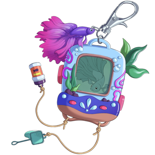
Here is a comparison to the old artwork.
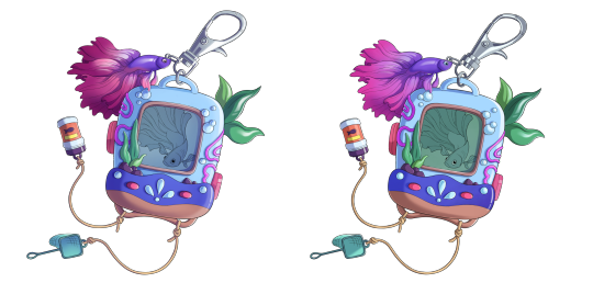
Toshi has very minimal changes. There are some minor color and shadow touch-ups, but as this was our most in-style original fauna, very little change was necessary.

Here is the new and old art.

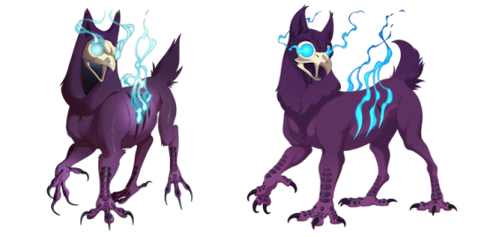
Like the Featherbeau and Kintsune, the Phantowl has a full overhaul. With a more dynamic pose and better detail, we hope to invoke spookiness in the new design.
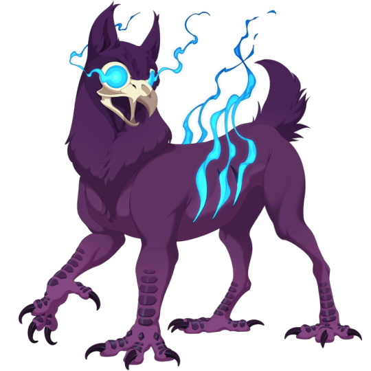
The new and old designs are below.
Accessories + Dye system
Speaking of designing accessories, we've finally begun production on our accessories! Here is a preview of what we are working on, showing illustrations of the original Gilded Helm and Iridescent Trail!
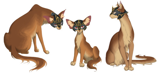
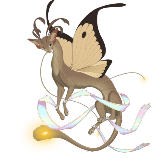
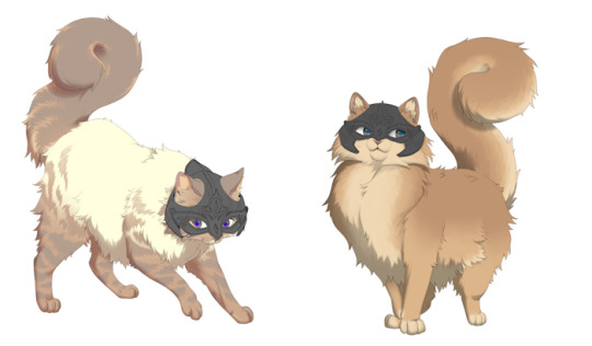
Our focus is on adapting challenging items. For example, the Helm, and similar helmet items, provide unique challenges when on fluffy breeds.
Here are a few previews of our solutions so far:
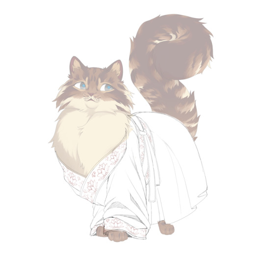
And here is a preview of our first backer-sponsored design!
Lastly, we’re very excited to announce a system we've been workshopping.
Accessory dyes!
PawBorough is built by the players, and it is in our interest as players to have as much quality customizability as possible. We want expansive options! All the recolors!
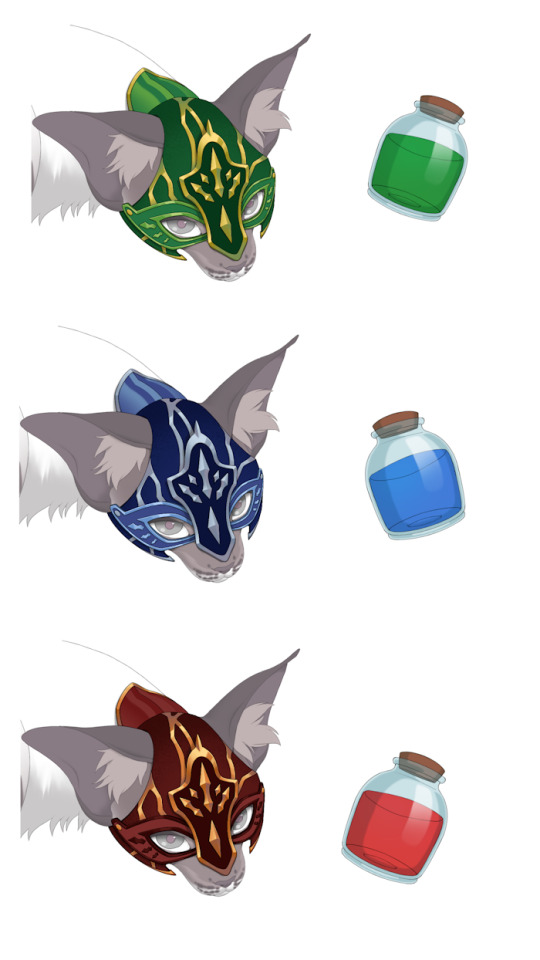
Accessory dyes will allow users to craft any accessory on the site into a different color.
The system we are designing incorporates “standard” and “special” dyes.
Standard dyes are a set number of colors which will be compatible with all accessories, meaning all accessory items get a blanket number of recolors.
“Special” dyes will only be compatible with certain items, and will include alternative colorings such as rainbow, pastel colors, gradients, patterns, etc!
The benefit of such a system means all items will get a set number of varieties, and it lets us expand upon certain pieces to include alternative or unique colorings. But it doesn’t commit us to an undoable recolor demand.
We’re still working out the kinks and pain points, such as easy to see information on what takes a special dye and what doesn’t, but we hope this will prevent item bloat, give users more creative control, and overall improve the gameplay!
Site Themes
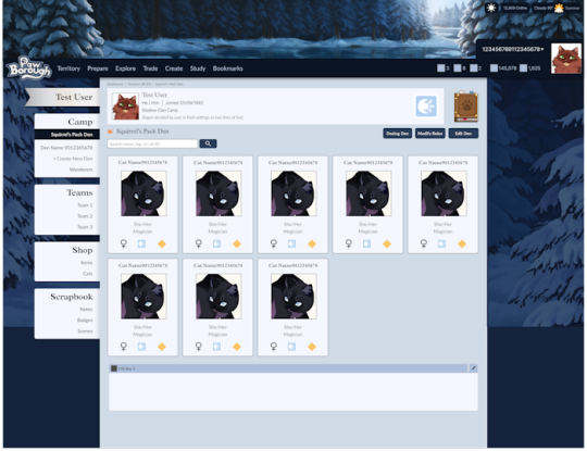
We’ve started workshopping the Borough themes with our completed assets. Take a look at these previews!
Zenith
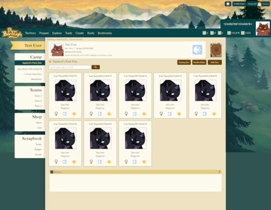
Luna
Pawprints
Next let’s look at a cute feature we have on the backburner.
Ever imagine your cat has polydactyly? While we can’t break lineart, we do have a fun new feature for rare cat collectors. Every cat will have their very own paw print on their profile, with a very very small chance of having a sixth toe!
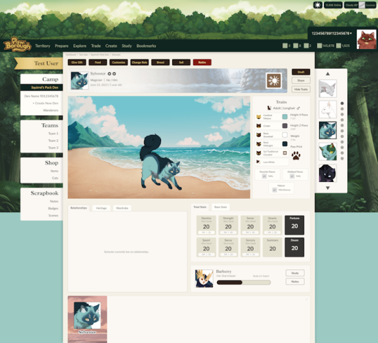


There are 55 unique pawprints!

Have fun trying for cats with silly paws ~
Stonehide texture
We’ve upgraded our asset technology! The rainbow sheen seen here on the scales of the Stonehide was a breakthrough in our coloring limitations. This texture will be applied to mystic breeds in the future and bring further quality to our assets!
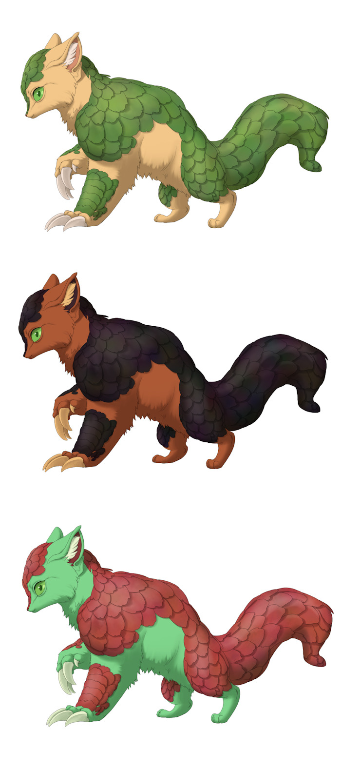
Great stuff!
On the backend, we've not done many notable new things this month, but we're continuing through as we prepare for a dedicated alpha. Longhairs were stuck with file processing complications, but we're working them out and working in tandem!
Speaking of alpha, we're looking at opening free applications for alpha and transitioning from solely an internal to a semi-external volunteer test. More information on this as we grow closer.
To Summarize: We showed updated Beta, Toshi, Phantowl and accessory assets, the dying system, two new site themes, a cute pawprint feature, and a new texture for mystic breeds.
What to expect next month: Further accessory assets, potential alpha update, and asset and software updates.
Note for Tumblr users: Something went wrong on our end, and while this update got posted to Kickstarter, it somehow did not got posted to Tumblr. We have re-uploaded it now for proper record keeping. Our sincerest apologies.
31 notes
·
View notes
Text
at this point I'm tempted to predict a future schism between mobile and desktop internet users, even more so then there is now. It used to be that there were the internet-savvy people and the non-internet-savvy people, where "non-internet-savvy" meant "doesn't know how to do anything except send e-mail at best".
These days we exist in a delightful sea of many many people existing and exchanging ideas on the internet, but more and more I see that things designed for mobile use are very much designed to make the user think as little as possible and consume as much as possible, all the classic things they said about TV numbing your brain etc etc in the pre-internet days. Basic internet skills like browser extensions, privacy controls, ad blockers, and knowing when a company's "sorry, you have to do xyz to use our site!" is unnecessary bullshit designed to make you their product, are falling by the wayside, with younger people with no computer simply not having access to that knowledge unless they explicitly go diving for it
It's pretty easy at this point to foresee a possible future that cycles back around to the "mainstream uncritical TV-watching consumers" versus "weird squirrelly computer nerds" era of the turn of the millennium, when knowing how to add animated gifs to your Geocities was rare technical knowledge and having a home computer was something only those who were kind of nerdy did. So many websites are redesigning themselves now to be the most compatible for mobile use, because that's where the bulk of users are and therefore the profits, with several websites I've used in the past (RIP DoInk) going fully app-only and becoming unusable on desktop. I'm seeing my first full-production music videos produced in vertical format, looking absurd on anything other than a phone screen. YouTube now literally has two faces: Shorts for mobile users and "classic" youtube (which also throws Shorts at you because those get more views and more profit). Sites geared to app-based use overwhelmingly censor adult content more than browser-based (in my experience), thanks in part to Apple's app store approval policies and iron grip on what you can install on your own iOS device, which also excludes all the people who want to quietly get their freak on.
Perhaps over the next decade this polarization might continue into a central hub of mainstream, corporate-controlled mobile-oriented sites that provide the main sources of knowledge and entertainment (again, we've gone back to TV), and some secondary, more "underground" hubs where the nerds and the freaks and the weirdos hang out. I mean it's already like that right now but as a certified nerd freak and weirdo who has gotten pushed away from mobile-oriented spaces it's interesting to imagine it more extreme, what the internet cultural tapestry might become, further along this path
153 notes
·
View notes
Text
A.N.I.M. Adventure Art: Benadetta (not to be confused with Burnadette)


Art by @theblackwarden
Meet Benadetta. Benadetta is a 30-something-year-old OSHA inspector who used to chain smoke but now vapes(this is mechanically important, it’s why she has very poor Athletics and other Physical skills and also is tied to her “Comfort Item” Trait.).
This art has been posted here with permission as part of A.N.I.M.’s Adventure Art initiative in our TTRPG book club.
Benadetta is a PC from Eureka: Investigative Urban Fantasy by A.N.I.M.
If you’d like to join the A.N.I.M. TTRPG Book Club, you can find the discord invite on our website.
If your art fits he parameters outlined on this post, and you’d like it featured here, tag us or post it in the book club’s Adventure Art channel on discord.
If you’d like to support us and get a prerelease copy of Eureka: Investigative Urban Fantasy, check out our Patreon! Our Kickstarter is planned for launch in April 2024!
Mild spoilers under the cut, details kept vague so as not to spoil the adventure module this we are using for this adventure, it's a Call of Cthuhlu adventure module (Eureka is compatible with those without much tweaking!) not one of our own.
Benadetta was the one who OSHA inspected the warehouse that then blew up like a week later, inciting the mystery. She feels like she could’ve been responsible for the explosion by not being thorough enough and that’s why she went out of her way to try and find out the cause—along with this weird woman, Yvette, whom she thinks is a V:TM LARPer(she went on like one date with a guy like that in college who also never broke character) from the Internet she met on r/warehouseexplosions.
Investigation ensued.
They found out that Benadetta was not responsible, it was actually a bomb, and this is part of an organized crime thing that much later they have discovered is a radical cult.
Also this weird woman from the Internet has been buying Benadetta things at the drop of a hat, like meals and a whole form-fitting biker suit that costs like $600(was part of a disguise) and Benadetta has been...not discouraging her at all.
Benadetta has been losing Composure rapidly throughout the adventure and is now constantly hovering between 0 and 2. Yvette is...really bad for the Composure of people around her.
The problem is that regular people restore 2 Composure at the end of every day, plus composure from the comfort of fellow investigators. However, Yvette just plain cannot do this. She has a -4 in that skill.
She found out a little more recently that 1. Yvette is a real vampire. and 2. Yvette murdered three armed organized crime enforcers with hardly a second thought when left to her own devices. This brought her Composure down again.
In the morning of the most recent session they went to an architect’s house to get some blueprints, only for Yvette to be lured away from the living room and blasted apart with a shotgun by one of the guy’s assistants with a shotgun upstairs(that’s a whole story), while the other assistant attacked Benadetta with a knife and cut her arm open.
Yvette showed back up in the nick of time, now holding that shotgun, and punched the teeth out of the knife-wielding assistant.
It turned out that the architect had no idea about any of this, the assistants were members of the cult whose job it was to spy on him, and murder anyone who showed up asking about those blueprints.
After visiting an Urgent Care for the knife wound and Yvette treated Benadetta to an expensive meal after Benadetta basically snapped at her and insisted she owed her for dragging her around into involvement with a deadly cult, so they went to a nice restaurant.
They later went to Chili’s after Yvette left Benadetta alone for a few hours to lay on her bed and cry at 0 Composure.) Oh and also Benadetta owns 4 pet rats that she cried with. She has not allowed Yvette to see them.
They had to go to Chili’s because through some cyberstalking they found out a member of the cult frequents it and Yvette thinks this specific guy has information and might even be receiving a bomb to deliver to a certain location soon. (Yvette wants that bomb so she can drop it in the mailbox of the cult HQ, which is something I think Benadetta doesn’t fully realize.)
Benadetta, however, only came along meaning to be moral support while making Yvette do all the work. Benadetta is just getting drunk on watered down bottomless appletinis. But, even drunk, she is quickly realizing what a mistake it was to send Yvette to talk to this guy alone.
Because Yvette’s Interpersonal skills are -3 or worse almost across the board.
Benadetta ended up having to pull Yvette away when Yvette wasn’t checking her text messages (texts like “HE IS TRYING TO FUCK YOU”) and try to talk a mortified Yvette into proposing a ‘ménage à trois’, so that they could get this guy to bring them home and get him even more drunk so they could just search his house. Yvette *could not* do it so Benadetta has to call him over and say it herself while seductively unbuttoning her dress shirt—despite looking almost literally as disheveled as one can look in Eureka(0 Composure) and being drunk and even failing the Seduce roll resulting in her belching loudly and then dying inside, they were just two-drunk-beautiful-women-proposing-a-threesome-to-meathead-dude-out-of-nowhere enough to pull it off and get him to take them home.
I think Benadetta could’ve done anything short of shit her pants and this guy would’ve still taken them home.

#ttrpg#eureka: investigative urban fantasy#coc#tabletop#rpg#roleplaying#eureka#indie rpg#call of cthulhu#indiegames#indie game#indie designer#indie games#indie#independant#rats#independant artist#art#adventure#adventure art#vampire#vampirism#vampires#vampcore#vampire aesthetic#vampirecore#monster#monster girls#monster girl#monstergirl
48 notes
·
View notes
Note
hi! this might be overstepping but my partner and i are working with the same equipment and genders as you and your girl. they really want me to fuck them but im not sure where to find a guide or information on pegging - any tips?
Dw about overstepping, I'm happy to answer questions like this!
I think googling "pegging for beginners" or something similar will get you some good info but here are some things I personally recommend:
If you haven't, try fingering your partner first! I found topping kind of daunting for a while because I had no experience in penetrating someone else when I first got together with my girlfriend, and learning how to finger her made me a lot more comfortable. Ask your partner to guide you in how to touch them - if they don't know, you can figure it out together!
Some beginner tips specifically for fingering: start with one finger and lots of lube. I like to really tease my girl's outer rim because not only does the anticipation make her crazy but she's really sensitive there. She's very responsive to a lot of gentle circular rubbing, and I increase the pressure bit by bit so that my finger slowly presses into her and makes her desperate for more. You can add more fingers after your partner gets comfortable. If they're an experienced bottom they might be able to take more right away, but if not progress slow.
The prostate (or g-spot, if your partner prefers) is towards the front, behind the balls. Practice finding it and try touching it in different ways - repeated pressing motions, hooking motions, circular motions. My girl is really partial to a good hard jackhammer. Keep your fingers lubricated and make sure your arm is in a comfortable position because if it's not, you're going to get tired and sore fast. This might mean adjusting your positioning or your partner's and might take some experimenting.
Take some time to stretch their hole out with multiple fingers before you put a toy in them. Lube the toy, too.
Keep baby wipes on hand! It's unglamorous but sometimes putting things inside someone's ass means you come back out with a little bit of shit. Wipes make cleanup quick and easy. If you're really worried about mess you can also put a towel down before you get started. You can additionally use finger condoms for your hands and regular condoms for your toys to make cleanup even easier and faster.
If you've already tried fingering them and you feel like you have a good handle on that, ask them to use a dildo on themself in front of you so you can watch how they like to be fucked with a toy. Then try fucking them with it yourself! See if you can mimic the way they were moving it and what gets the best reactions out of them.
If you've never worn a harness before, I really recommend the brief-style harnesses that you can find from websites like Rodeoh. All you have to know is your measurements and the size of your toy and then when you've got your briefs in your hands you can just pull them right on - you don't have to worry about adjusting any straps or anything like that.
Get a stabilizer to go with your harness to make sure that your dildo doesn't try to escape mid-fuck. It definitely interrupts things if your dick retracts into your harness while you're trying to rail your partner lmfao (although it is also very funny).
I personally get very bruised if I strap without some kind of padding between the base of the toy and my body, probably because my baby loves being fucked really hard, so I'd recommend a silicone cushion of some kind. Even if your partner likes it gentle it's worth looking into. There are simple cushions that are just meant for softening impact, and then there are fancier ones that have shapes meant to stimulate the wearer like the Bumpher. I don't find that my Bumpher necessarily provides much stimulation for me but I definitely prefer pegging with it to pegging without it (ow).
Use lube that's compatible with your dildo! Don't use silicone lube with a silicone dildo, it can ruin your toy.
Try different angles and positions with your strap to see which ones feel the best and which ones you can fuck in the longest! It might take some practice to get things feeling fluid and comfortable, but that's normal.
I might be forgetting something, so if you have other tips, leave them in the replies or reblogs! :)
(DNI if you: are under 18, do not have your age on your blog, or post ageplay/ddlg, hard cnc/rape play, incest kink, dykebreaking content, misgendering kink, or detrans kink)
24 notes
·
View notes
Note
Do you like the theory that the King's son died because he was playing in a hardcore world?
because like the stick figures are playing in Minecraft worlds used by other "real" players from their computers. The world that the King's son played in was a hardcore world that was played by someone, and that person died, which deleted the world. This is why the King's son got deleted with the world.

AYO?
HMM!!
I haven't heard about this theory yet! I think that's really interesting and I can certainly see why people would latch on to it!
If the 3 stick engineers were hacking into Minecraft worlds from "Player" accounts, then if the world is a Hardcore world that does give a reason why the Minecraft world suddenly got deleted. Since the "Player" died.
Granted, this maybe different because they're stick figures hacking into a Hardcore world, but Hardcore world's don't actually delete themselves when you die. Once you die, you're still able to visit the world as many times as you like via Spectator mode. Maybe when the "Player" died, Gold got sucked into the game and lost connection to the server and is now permanently stuck in Spectator Mode.
Though personally, I don't think that's what happened.
These guys are running a business. I don't believe they'd take the risk of the Minecraft World shutting down that is associated with Hardcore worlds.
Along with that, you may not know this about me, but I run a Minecraft server in my free time for a couple of my friends but I don't host it on my computer. I use a website called "Aternos" to host my Minecraft server. It's not the best Minecraft hosting site but it's free and mildly flexible when it comes to mods and plugins!
If I had to guess, I think the guys running the "Minecraft Experience Booth" were using a "shoddy" hosting site to host the Minecraft server and then something went wrong server side that corrupted the entire server.
I can tell you from experience, being the Admin of a Minecraft server can be little daunting. It's easy to mess the entire world up if you're not careful when updating the world from one version to another, adding in mods and plugins, checking through the player data, etc.
Sometimes things on the server won't work right if you have a mod pack that's out of date or isn't compatible with the version of Minecraft you're using for the server.
It's a lot of work and sometimes bugs and glitches still happen! In the episode itself, you can see the 2 Sticks manning the controls receive an error warnings first before the corruption kicks in. Although we can't read the screens, those lines of code look like "Error Logs" to me. Usually Hosting Services will have a place for you to look at the Server Logs.
Actually, looking back at the episode, the entire thing is called a "Minecraft Simulator". So maybe they aren't even using a real version of Minecraft. AND IT'S STILL IN EARLY ACCESS
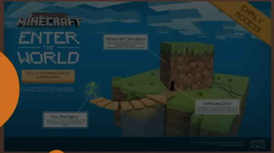

alskdjglsgsd
ALSO HOLD UP
WHY ARE THEY USING 1.7.10 AS THE SERVER BASE???

HELLO??
THE TRAILER THEY WERE SHOWING OUTSIDE THE BOOTH CLEARLY SHOWS 1.19 SINCE IT INCLUDED THE CHEST BOAT
DAMN THIS REALLY IS "EARLY ACCESS"
King should sue them for false advertising /j
[EDIT: IT HAS COME TO MY ATTENTION THAT IN THE AvM SEASON 3 COMPILATION THIS SCREEN ACTUALLY GETS CHANGED TO SAY "1.17.0"
King should still sue them alskdlgjslsdlkgj-]

#Sammy8D answers#Anon#anonymous#alan becker#Animation vs Minecraft#AvM Shorts#AvM short 30#Avm Gold#AvM King#Gold stick figure#King stick figure#AvM Mango#ALKLSJDG#GODDAMN I WROTE A LOT#Sammy info dumps about the Technical side of hosting a Minecraft server for half an hour#AvM theory#Sammy8D Stick Stuff
97 notes
·
View notes
Text
Menehune

Image by Hugo Solis, © Frog God Games. Accessed at the artist's deviantArt page here
[This is art from an actual Pathfinder product! These menehune appeared in Razor Coast, a long delayed (and sadly, not very good) 3pp Pathfinder module. The mechanics that game used for menehune was as a variant of gnomes, which makes a certain amount of sense, with fire themed powers, which doesn't. That kind of sums up all of Razor Coast: it was more interested in stereotypes about Pacific Islanders and riffing on vaguely Hawaiian themes (like Pele and volcanoes) than it was about actual Pacific Island cultures.
Interestingly, there's a fair amount of debate about the age and origins of menehune legends. Some folklorists believe that they're syncretic, a combination of Native Hawaiian stories with European fairy lore. Others say that, because "manahune" is Tahitian for "commoner", that the original menehunes were an ethnic minority that was disenfranchised and displaced following Tahitian immigration to Hawaii. I was unable to find a scholarly or semi-scholarly reference to the idea that menehune use arrows, Cupid style, to make people fall in love, but it's commonly reported on Hawaiian tourism websites. Plus, it gives them a unique ability.]
Menehune CR 4 CN Fey This little humanoid is stout and heavily muscled, with red hair and a mischievous twinkle in their eyes.
Menehune are especially human-like fey who live on tropical islands. They are expert craftsmen and builders, and their monuments and achievements crop up overnight. Literally—menehune are strangely perfectionist, and if a construction job takes them more than a single night, they will abandon it. Fortunately, they work with supernatural speed, and a team of menehune can create roads, aquifers or ramparts in a matter of hours. Menehune dislike being interrupted or observed in this work. Menehune sleep during the day and work at night, typically in hollow trees, caves or other places that are comfortably dark. They are omnivorous, and feed on a diet of fruit, tubers and fish. Bananas are a particular favorite. Menehune are afraid of owls.
Few menehune relish a fight, but their incredible strength makes them relatively skilled combatants. If interlopers attempt to spy on their work, the menehune will usually flee, although they may fire magical charming arrows as they go. These arrows do not charm the struck creature to the menehune, but instead cause brief, rapturous love towards the first compatible person the victim sees. If the menehune are pursued, or if their constructions are damaged, they may well respond with lethal force.
A menehune stands between two and three feet tall. Most have brown skin and red hair. They may be mistaken for especially burly halflings, especially at a distance.
Menehune CR 4 XP 1,200 CN Small fey Init +2; Senses darkvision 60 ft.,low-light vision, Perception +7 Defense AC 15, touch 14, flat-footed 12 (+1 size, +2 Dex, +1 dodge, +1 natural) hp 45 (7d6+21) Fort +5, Ref +7, Will +5 DR 5/cold iron; SR 15 Weakness light blindness Offense Speed 20 ft. Melee heavy mace +8 (1d6+6) Ranged masterwork composite shortbow +8 (1d4+4/x3) Special Attacks arrow of love Spell-like Abilities—CL 4th, concentration +6 Constant—ant haul, pass without trace At will—invisibility 3/day—charm animal (DC 13), charm person (DC 13) Statistics Str 18, Dex 15, Con 16, Int 11, Wis 10, Cha 15 Base Atk +3; CMB +6; CMD 19 Feats Dodge, Endurance, Point-Blank Shot, Power Attack Skills Acrobatics +9 (+3 when jumping), Bluff +9,Climb +10,Craft (stonemasonry) +11, Diplomacy +9, Knowledge (engineering) +4, Knowledge (nature) +7, Perception +7, Stealth +13, Survival +7, Swim +10; Racial Modifiers +4 Craft (all) Languages Common, Sylvan SQ expert labor Ecology Environment warm forests and mountains Organization solitary, pair, gang (3-8) or crew (9-24) Treasure standard (Small heavy mace, Small masterwork composite shortbow (+4 pull), 20 arrows, other treasure) Special Abilities Arrow of Love (Su) Three times per day, a menehune can infuse an arrow with charming magic as a swift action. A creature struck by this arrow takes no damage and must succeed on a DC 20 Perception check to realize they’ve been shot at all. A creature struck by this arrow must succeed a DC 15 Will save or fall in love with the first acceptable creature it sees (of a species and gender to which it would ordinarily be attracted to). This functions as an elixir of love, except that it can affect humanoids, fey, native outsiders and animals. This is a charm effect, and the save DC is Charisma based. Expert Labor (Su) A menehune can do as much work in a half hour as a human laborer can accomplish in a day.
49 notes
·
View notes
Text
I need to start my reread of the Stormlight Archive in preparation for SA5. The problem is that the other fandoms currently interwoven in my brainwaves like the lattice on an apple pie are Genshin Impact and SVSSS. And like, the last time this happened, I made a whole Fire Emblem Three Houses break down of what radiants all of the characters would be, and I think that would be so funny to do with SVSSS, because, like Fire Emblem, there’s virtually no overlap between fandoms. YQY probably being a Bondsmith is so ironic to me. You mean the character who struggles with the one Bond(TM) that really matters to him is gonna be a Bondsmith? Someone meant to unify everyone when he can’t even unify himself with Shen Jiu?
Each peak could be a different order of radiants, which would make one order of radiants just… entirely women. Bai Zhan is just one solitary Skybreaker (or Windrunner, but I think Skybreaker fits LQG more). It doesn’t really fit with SA lore but that’s fine and funny. Like, let’s be honest. What is cultivation if not just another form of Investiture? Maybe the Ling Xi Caves are near a perpendicularity which is why they’re a great spot for secluded cultivation. “Don’t go too deep into the caves. People disappear into them, never to be seen again.” They just went to another planet. Don’t worry.
The more I think on it, the better it gets I think. Like, some things start to Fit. Listen.
The Demons are the Singer equivalent. Why, because they’re the perceived villains who are Evil for no reason? No, because they were in the world first. Why would I say that? Because their cultivation is Strong. The book says that a three year old demon is already capable of killing a fully grown (non-cultivator) adult. While sy might have exaggerated a bit, it makes sense that they would be Compatible with this world’s Investiture. Humans came late to the world and aren’t as compatible.
Their swords are their spren equivalent. Give them a voice, let them change around somewhat, it’s fun.
Upon thinking about it a little more, I’m assigning some characters orders that they would fit in either bc I think they fit to a T or because it would be funny:
Shen Yuan: Lightweavers - this is a funny one (mostly because I’m not sure??? Where else he would fit???) but imagine him having to come to the realization that he IS gay for Binghe and that literally makes him more powerful?
Luo Binghe: Windrunner or Dustbringer - He can go either way I think. Windrunner’s “I will protect” fits but literally only for one person. I can imagine him saying his vows ‘I will protect my Shizun, who cannot protect himself.’ ‘I will protect my Shizun, even if he makes dumb decisions.’ But Dustbringers focusing on self-mastery, the most destructive of the orders, who are sad that they’re thought of as the most destructive. Dustbringers who are usually creative people who like taking things apart to see how they work. Dustbringers using their power to destroy for good (and to protect Shizun ofc). Also, if their swords are spren/their spren are their swords, then Xin Mo is absolutely an ashspren over an honorspren
Liu Qingge: Skybreaker - I said earlier that Windrunner might also fit him, and that’s true. But Skybreakers seeking justice as what SHOULD happen as opposed to the law. Pulling from Sanderson’s website, the current skybreakers are stricter than they used to be, so I think that lqg would be like the skybreakers of old. People that didn’t adhere strictly to the letter of the law.
Yue Qingyuan: Stoneward - I know I said he would be a Bondsmith but I think it might go either way. “I will be there when I’m needed.” That’s like, the most YQY desire ever.
Shen Jiu: Elsecaller - Listen. Hear me out. SJ cares so much about his cultivation and becoming stronger. I first wanted to put him in Dustbringers (self-mastery) but he’s too brazen for the order I think. He wouldn’t slow down to worry about control (think about all those qi-deviations he went through) and “I will reach my potential.”? That’s all he wanted to do, really. Become stronger.
Shang Qinghua: Edgedancer - literally just because I think it’s funny. “I will remember” but the man literally forgets like key things in the world he created (looking at ZZL and then sy as if to ask ‘did I make that?’). And having power over the abrasion surge makes him, quite literally, incredibly slick/slippery.
Bonus: Sha Hualing is a Singer who’s just constantly in mateform.
If there is anyone else out there who has this niche overlap of books that live in their minds rent free? Please weigh in if you agree or disagree with what I said. Or ask questions, because like. I can do some more Thinking. I’ve already done more Thinking and I would love to talk to someone about it
#stormlight archive#svsss#AU#Stormlight archive spoilers#technically because. I talked about the singers being here first
3 notes
·
View notes
Photo

Why I am deleting Goodreads and maybe you should, too
I can’t remember the last time I enjoyed reading a book where my enjoyment wasn’t tied to the euphoric sense of achievement I got from finishing it. This is not because I don’t love reading, or would rather watch television. No, it’s because of a little app on my phone called Goodreads.
Home to about 90 million readers worldwide, Goodreads is a website that lets users track their reading and broadcast their tastes to the world – or, in my case, a few friends and vague acquaintances. At its core, it’s a harmless concept: an online community for bookworms, and an opportunity to discover new books your friends have loved.
It’s also extremely satisfying. Since joining Goodreads a few years ago, the annual roundup I receive tallying up the books I have finished that year has become the clinching point of my reading experience. I get a buzz from increasing my reading goal every 12 months, and from comparing how many pages I’ve turned or hours of audiobooks I’ve listened to with other people’s numbers. I feel a sense of accomplishment every time I update my “progress” with a book.
But that’s exactly what’s wrong with Goodreads: it turns reading into an achievement. Quantifying, dissecting and broadcasting our most-loved hobbies sucks the joy out of them. I find myself glancing towards the corner of the page to see how much I’ve read. I compare the thickness of the read pages I hold in my left hand to the unread ones in my right. Even when absorbed in the climax of a story, one eye is always on my proximity to the end, when I’ll be able to post it all to Goodreads.
It’s not just our reading habits that have been gamified. From our runs on Strava to the films we’ve watched on Letterboxd, there’s now a popular app to quantify all our hobbies. But with reading come the associations of intelligence and work that are not granted to our habitual consumption of other art forms; if I documented the amount of television I watch, I would feel more embarrassed than triumphant. This is why tracking my reading activity on Goodreads is far more performative than I have previously admitted to myself: I love reading, but I also love the feeling of people thinking I’m well read.
While some people’s qualms with Goodreads are rooted in its clunky interface, or the fact that it is owned by Amazon, mine lie in its very concept. Reading is something I do to relax, learn and enjoy. It’s not just that I don’t need a pie chart detailing my reading habits, the chart has poisoned the whole experience. Even if I were to switch to another book app without the social aspect, I know that I would remain obsessed with finishing books over enjoying them.
It’s human nature to get a sense of satisfaction from seeing something through to the end. But, without Goodreads, it won’t matter if I give up on a book I’m not bothered about halfway through, because no one will know or care – as if they did anyway. I won’t be self-conscious if I read yet another thriller bought in a supermarket deal, instead of something others would consider as smarter or better.
If Goodreads provides a sense of community, good recommendations and doesn’t make you obsess over what you’re reading or how much, then great. Maybe it’s just a few of us who aren’t compatible with it, and end up developing a toxic relationship that distracts from the magic of getting lost in a book. But right now I am reading my first book Goodreads-free since I installed the app. It feels just like it did when I was a child, with no awareness of what others think about what I’m reading, how quickly I’m reading it, or what I haven’t read. From now on, my reading habits are staying between me and my book.
Daily inspiration. Discover more photos at http://justforbooks.tumblr.com
17 notes
·
View notes
Text
The Time Setting of Damian's Flashback
Some time ago, I encountered a discussion about Damian's uncertain age (a point I concur with), suggesting he might indeed be a child. This is a subject that seems to spark some debate (some websites state he is 16), so I wanted to try to sort this out. We know very little about Damian himself and even less about the true ages of the characters (though some can more easily be guesse). However, we have some material to work with. In episode 95, we saw a younger version of Damian with Ziggurat, who gave him a bey. This moment symbolized Damian's entry into the world of Beyblade. However, due to certain informations, the time setting might be much closer than we thought.
The Creation of the Arrangement System
"After studying those events, I decided to employ a more scientific approach when analyzing the power of Beys and perfected a method to maximize a Bey's potential through science: the arrangement system."
Dr. Ziggurat in Episode 87 (The Plot Thickens)
The events Ziggurat is referring to are mostly Ryuga's loss of control during the end of Battle Blader, as well as Doji "losing sight of the true goal." He clearly states to Ryuga that he created the arrangement system after Battle Blader. Some might argue that he was lying, but he previously stated his true goal (which would be verified later) to Ryuga, so he had no reason to lie about that.
This element doesn't outright give us the moment the flashback happened. However, it's possible to theorize that Damian didn't undergo the arrangement system before Battle Blader. This tournament is at most a year before the World Championship (although it's not precisely stated), but there's a window of time between Ginga's victory and Masamune's arrival in Japan. So, during Metal Fusion, he still had a normal appearance.
Damian's Physical Appearance
Although Damian's portrayal exhibits minor inconsistencies, fluctuating between childlike and late teenage appearances, his stature remains consistent. In the reminiscence, he appears significantly shorter than Ziggurat, aligning with his elbow. This proportion seems unchanged during the Spiral Force showcase, indicating minimal growth. Also, Damian has long legs (not visible in the flashback) compared to his body, which contribute to his diminished stature. This could indicate that he didn't age much between the two events and that they could be close in time.
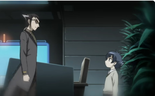
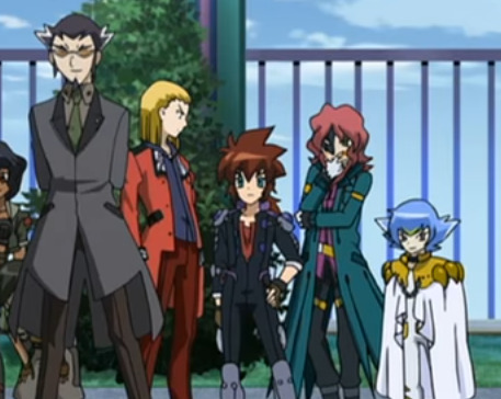
Depending on the shot during the flashback, his features aren't as soft, and he doesn't seem so dissimilar from his past self (except for longer hair and more frowned eyes).

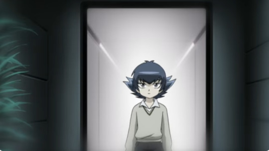
Another point I wanted to add is that the arrangement system (for the most compatible Blader like Faust and Damian at least) has a drastic effect on one's appearance: Toby's features become much harder, and his hair grew noticeably in a short amount of time (between the end of the World Championship and the Spiral Force event). Knowing that, it should be no surprise that Damian's appearance also underwent a similar impact because of the arrangement system.


Links with the plot.
To summarize: The arrangement system's creation occurred after Fusion, Damian's height remained constant from the flashback to the present, and the system has the capacity to modify physical features.
In addition, it is said multiple times that Damian only played Beyblade because of Ziggurat telling him to do it and his compatibility with the arrangement. According to what Ginga says (and sometimes Ginga understands people better than they understand themselves), Damian was asked to do Beyblade and then became a test subject for the arrangement.
"I see you really are just a victim in all of this. You did as you were told and took up Beyblade. Did as you were told and became some kind of lab rat test subject."
Ginga Hagane in episode 95 (Showdown! Gingka vs. Damian)
Damian only cared about Beyblade so long as he was the "chosen one," and that was what Ziggurat wanted. His mindset of playing and torturing people might have come from the fact that he gained seemingly unlimited power easily and rapidly. He never aimed at making an effort to become strong, so his only distraction in a fight is to put the opponent down while establishing a natural order: He is strong; the others are weak.
This mindset could hint that he never trained in a traditional sense, nor ever used his own strength alone. It is very well possible that after this scene, he went straight to the arrangement. Meaning that the Damian we see in the flashback could very well be Metal Fusion or even early Metal Masters Damian.
#metal fight beyblade#damian hart#Faust beyblade#Toby mfb#ziggurat#gingka hagane#beyblade metal masters#Beyblade theory
6 notes
·
View notes
Text
Plamo?: Bandai Shokugan 66 Action Dash: Mega Man 2

This is a series of mini-figures that i think were sold in blind boxes, maybe? I think i still have the boxes, they might have been labeled; but when i bought them, it was as a set of all five off of the shopping website i won't name here. They're not full model kits, mostly poseable mini figures with some changeable parts. But those extra parts come on tiny runners, so maybe that counts for something? lmao. But they all came pre-painted, which they did a pretty decent job on. it's nothing spectacular, but probably worth the price you'd pay in Japan (I actually didn't check the MSRP on these because i assumed i was getting them at a markup) The reason i ordered this set is because they came with Vile and X figures, which are compatible with the Super Minipla line of Ride Armor's from Mega Man X (which will be a separate entry on this blog)
CUT MAN:


This CutMan figurine is pretty nice. As you can see these are eminently poseable, but they're also a little fragile. Still, once you get them into a decent position they tend to stay. The Rolling Cutter actually has a good friction fit in his right hand. SUPER MEGA MAN:
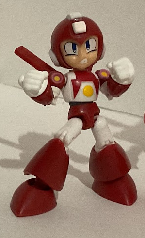
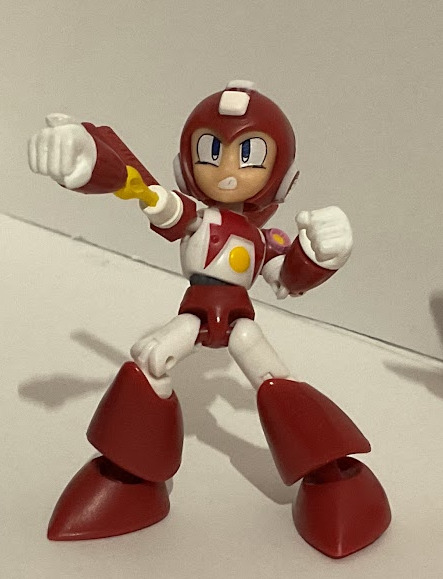
I love this boy. As a kid i had (and still have actually) a pencil topper of Super Mega Man. I love this little figurine doing the rocket punch from the games that have this feature. Gotta point out the paint jobs on these are pretty okay. Not like super refined but they're definitely charming and great. GEO STELLAR / MEGA MAN STAR FORCE??:
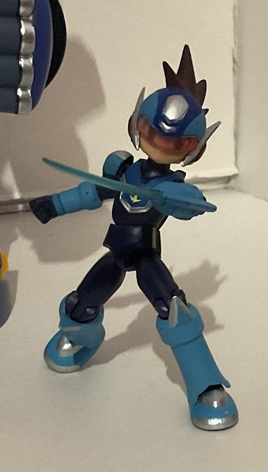

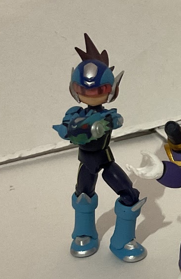
I admit, i don't know much about this particular subseries. I tried to play the first star force once, but couldn't get into it. nonetheless, he came with the set, so here he is, posing for you! MEGA MAN X:

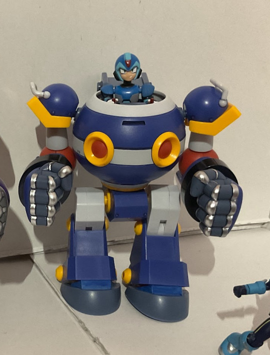

Okay so this and the next figure are the primary reasons i got this set. As you can see, it comes with swappable pieces that allow him to pilot the Ride Armor Super Minipla kits. Not going in depth on these here, but here you can see the "painted" (with gundam markers) job i did in 2020 when i went full hog into Plamo. I believe the silver used was a metallic silver gundam marker, GM177 to be exact. It was very stinky!! A strong, acrid smell. Anyway, I'm currently working on repaints of the Chimera kit to recreate game-accurate-ish versions of the Hawk and Kangaroo Armor. Actually, here's a sneak peak of that:

Anywho, that's all for another post. The last guy left is..
VILE:

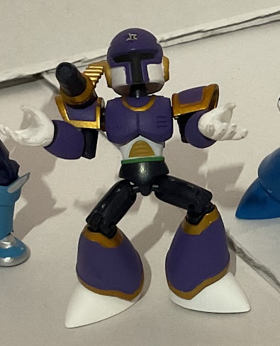


You know him as the devilish rival to X. You can see the minifig has a magazine for his vulcan coming from his backpack. The minifig is nice, though the only customization he has is the hands gripping the steering stick. Or you can make them look like he's laughing maniacally. Either way. Maybe the back of his head could use some panel lining and painting? but i don't feel like trying that over a pre-painted surface. Not sure why the joints seem to be splitting at the seams. Could be a good reason to revisit this model one day with sprue glue or some such. I usually keep these guys displayed diorama style in my light cabinet on the megamans shelf:


I know they've never actually faced off in their ride armors before. In my defense, toys are for making cool scenes so i will do just that with them. Anyway in conclusion, I really like Mega Man and have since i was a child, thank you for coming to my TED Talk. Here's the stats for this set (and yes some of the spare parts for these figs came on sprue)

Not super wasteful on the consumer side of the plastic equation.
3 notes
·
View notes
Text
Fediverse for tumblr users
Ok so I said the other night I'd do a write up of how to fediverse for tumblr. Because tumblr is, as ever, in danger of screwing us all over to a similar degree to what twitter and reddit have been through recently.
First, some definitions
Fediverse (fedi) - a whole bunch of different websites running compatible platforms that can talk to eachother
mastodon - one of the larger kinds of platforms that make up the fediverse, there are others, but mastodon is the common twitter/tumblr ish one in terms of functionality
lemmy and kbin - two other kinds of fediverse platform, which you might have heard of recently as a number of reddit communities have moved there. Lemmy and kbin can talk to mastodon and you can see posts between them, it's just a different layout.
federation - the link between two different sites running fediverse platofrms, that lets users see content from all different sites
de-federation - breaking the link, basically blocking a whole website, so if someone sets up a nasty website for spreading spam or something, your admins can block it completely
Great, so what's this mastodon thing anyway?
You might have heard about mastodon while twitter was doing its major implosion under elon. From your perspective, it's a collection of microblogging sites that can all talk to each other, so if you set up an account on one of them, you can follow and be followed from other ones, without being beholden to their moderators. If you don't like the admins on your particular site, you can switch to another site running a similar platform and take your followers and following lists with you. The important bit is that it pretty much Just Works. Log in, make posts, like, boost, reply, follow people you like, look through tags, see what's out there.
If you want to make an account, I recommend taking a look at https://fedi.garden/ as a place to find sites that are likely to have people with shared interests. Personally I'm on tech.lgbt, a community of queer people interested in computing, and it's a really nice place. Signups are currently manually moderated, so you can be fairly sure there aren't spammers or bots there.
There are lots of large fediverse sites out there, which you can also join, and lots of country or language specific ones. Pick one, or let me know a couple of things you'd be looking for in that community and I'll do some searching and find one you might like.
If you're super techy you can even host one yourself, but that's well beyond the scope of this post and if you're into that then I'm sure you can figure out how.
If you're interested in looking for replacements for other socials, the fediverse has most of them covered
twitter and tumblr -> mastodon
reddit -> lemmy or kbin
instagram -> pixelfed
youtube -> peertube
twitch -> owncast
they all work a little differently, but they all talk to each other, so I can see pixelfed or peertube posts from my account on tech.lgbt, and people on those sites can see my posts.
it's also worth noting that mastodon isn't the only kind of fediverse site that behaves like twitter or tumblr, you might see things like calckey, GoToSocial, akkoma and others. They're all broadly the same for you as a user, and your admins will tell you if you need to do anything if they change from one to another. tech.lgbt just changed from mastodon to GoToSocial and it was seamless for me, same account, same app.
Speaking of apps, there's heaps of different apps you can use to view your feed and use your account, including the web interfaces, which are fairly polished on their own. iOS and android have different apps available, and many of them are open source. Several makers of now defunct reddit third party apps are working on lemmy or kbin apps, so if you were a fan of Apollo then there may be a lemmy app for you soon.
I use Ice Cubes for iOS, but I'm looking into switching because I'm not totally happy with some of the stances of the creator on things like AI integration, and there are other apps out there I can just switch to. If you don't know where to start, there's nothing wrong with the default mastodon app, and a lot of people use it.
4 notes
·
View notes